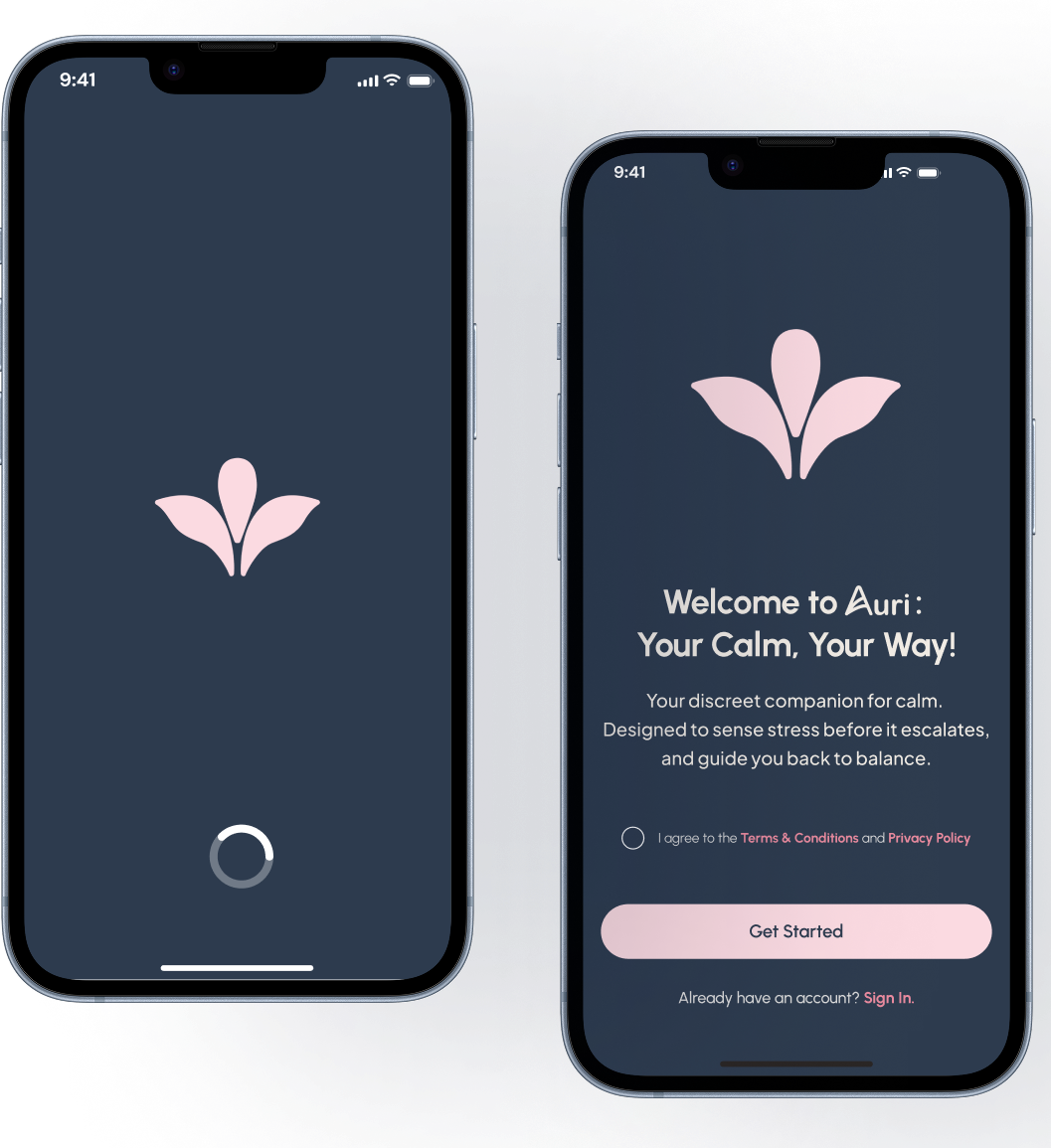
AURI

DIGITAL PRODUCT & INTERFACE DESIGN

HUMAN-CENTERED DESIGN
UI/UX DESIGN
DIGITAL PRODUCT DESIGN
3D-MODELLING & RENDERING
FIGMA
BLENDER
AFTER EFFECTS
PHOTOSHOP

THE PROBLEM

SEEKING CALM

THE BRIEF

DESIGN CHALLENGE

THE SOLUTION

AURI SYSTEM

INTENDED AUDIENCE

WHO IT'S FOR

THE PROBLEM

In a world that often demands constant productivity, many people struggle with stress, anxiety and physiological dysregulation. Yet, most solutions require them to pause and actively seek calm.

The challenge: How might calm meet the user where they are, rather than asking them to stop their lives to find it? Auri was born from this question, an exploration into how wearable technology could integrate with rhythms of daily life to bring calm in real time, supporting users through breath, heartbeat, and body awareness without disrupting their routines.

THE BRIEF

The brief was to design a 3D digital product prototype paired with a functional UI/UX interface that addresses a self-identified human-centred problem.

Deliverables included: A 3D modelled wearable device rendered with attention to materials, surfaces and lighting. A fully designed mobile companion app interface for control, customisation and monitoring. An animated product reveal and explainer video showcasing user journey and functionality of a brand identity system aligned with the product's purpose and tone.

THE SOLUTION

Auri is a wearable designed to bring calm into the chaos. A soft, adaptive device that listens to the user's breath and heartbeat and responds in real time with intelligent haptic feedback.

It guides breathing patterns, grounds the body, and adapts to the user's physiological state as they move through daily life.

The companion Auri app extends this experience by offering deeper personalisation and control. Users can calibrate the device, view resting and average breath/heart rates, and customise comfort modes, guided sessions, and accessibility preferences. Together, the device and interface embody the core concept: "Calm should be within reach, not something we chase".

INTENDED AUDIENCE

Auri was designed for individuals who experience stress, anxiety, or sensory overwhelm, particularly those who may struggle to find moments of calm in busy, demanding environments.

The project especially considered neurodivergent users and people with high-stress lifestyles, aiming to support emotional regulation and grounding in an unobtrusive, wearable way.

CONCEPT & NARRATIVE

In a world that constantly asks us to do more, calm has become something we have to chase. Auri reimagines this relationship by asking:

"What if calm could meet you where you are?"

Designed as a wearable companion, Auri listens quietly to your breath and heartbeat, responding in real time with gentle haptic guidance. It transforms biofeedback into a language of care, adapting, learning, and grounding you through motion, rhythm, and touch.

Auri is more than a device; it's a moment of calm made tangible, a soft interface between technology and emotion.

LOGO & BRANDING

"Auri" the Name:

The name Auri comes from the Latin auris, meaning "ear" or "to listen". It represents the device's quiet intelligence, a technology that doesn't demand attention, but instead listens to the body's rhythms and responds with calm before stress takes over. Auri symbolises attunement, a moment where calm meets awareness.

Auri Device
Auri Device
Auri Device
Auri Main Logo

The Wordmark:

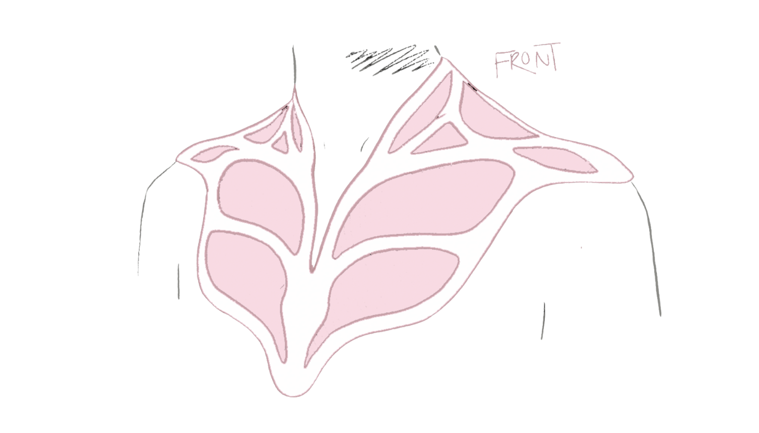
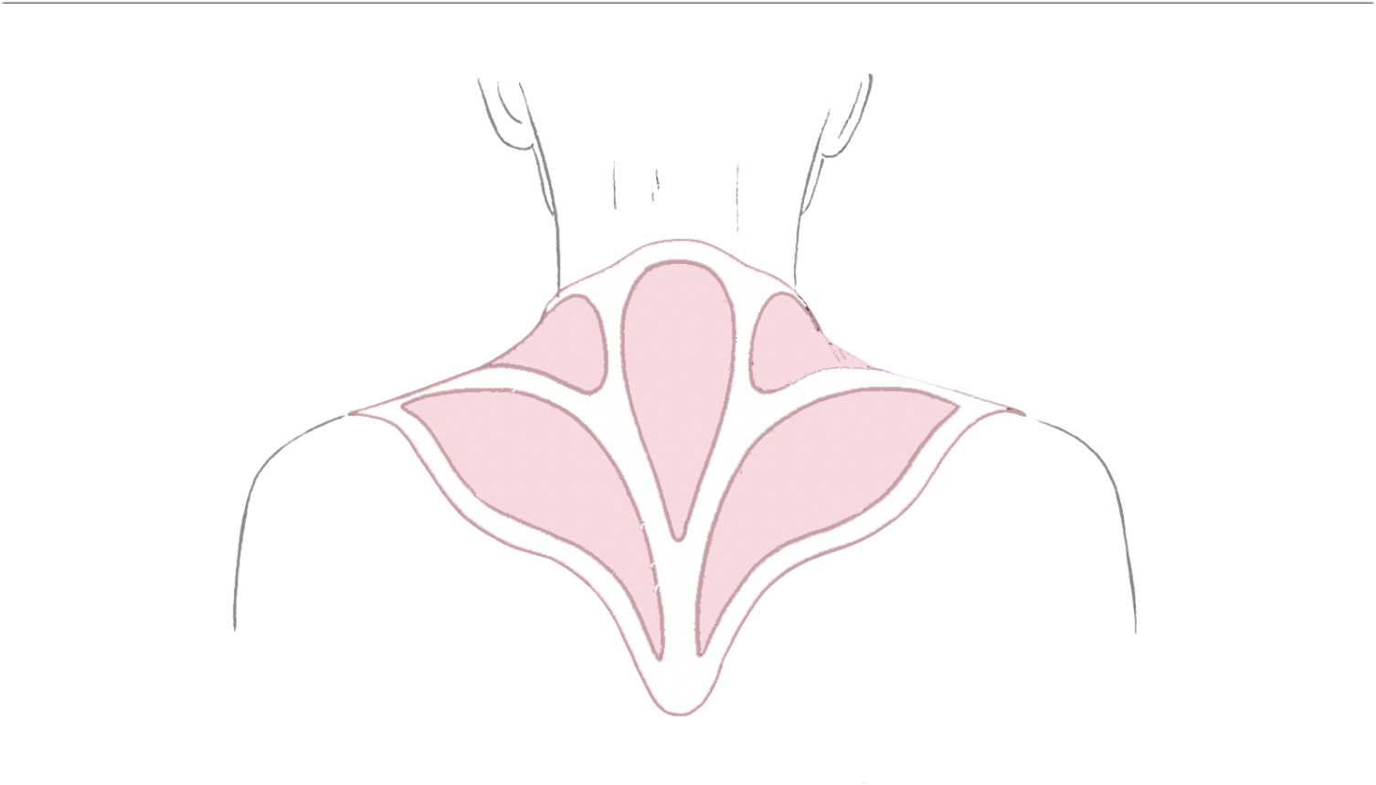
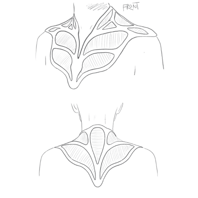
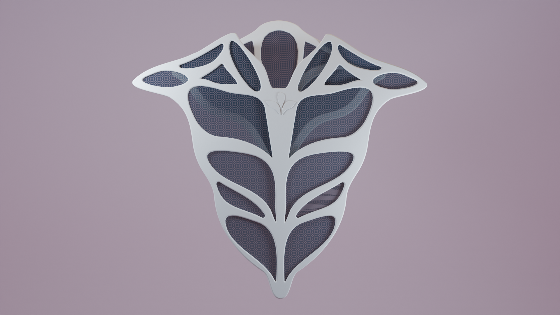
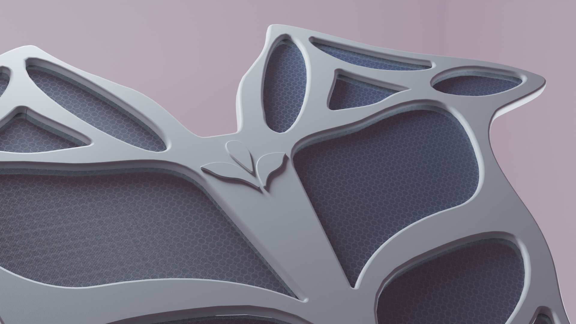
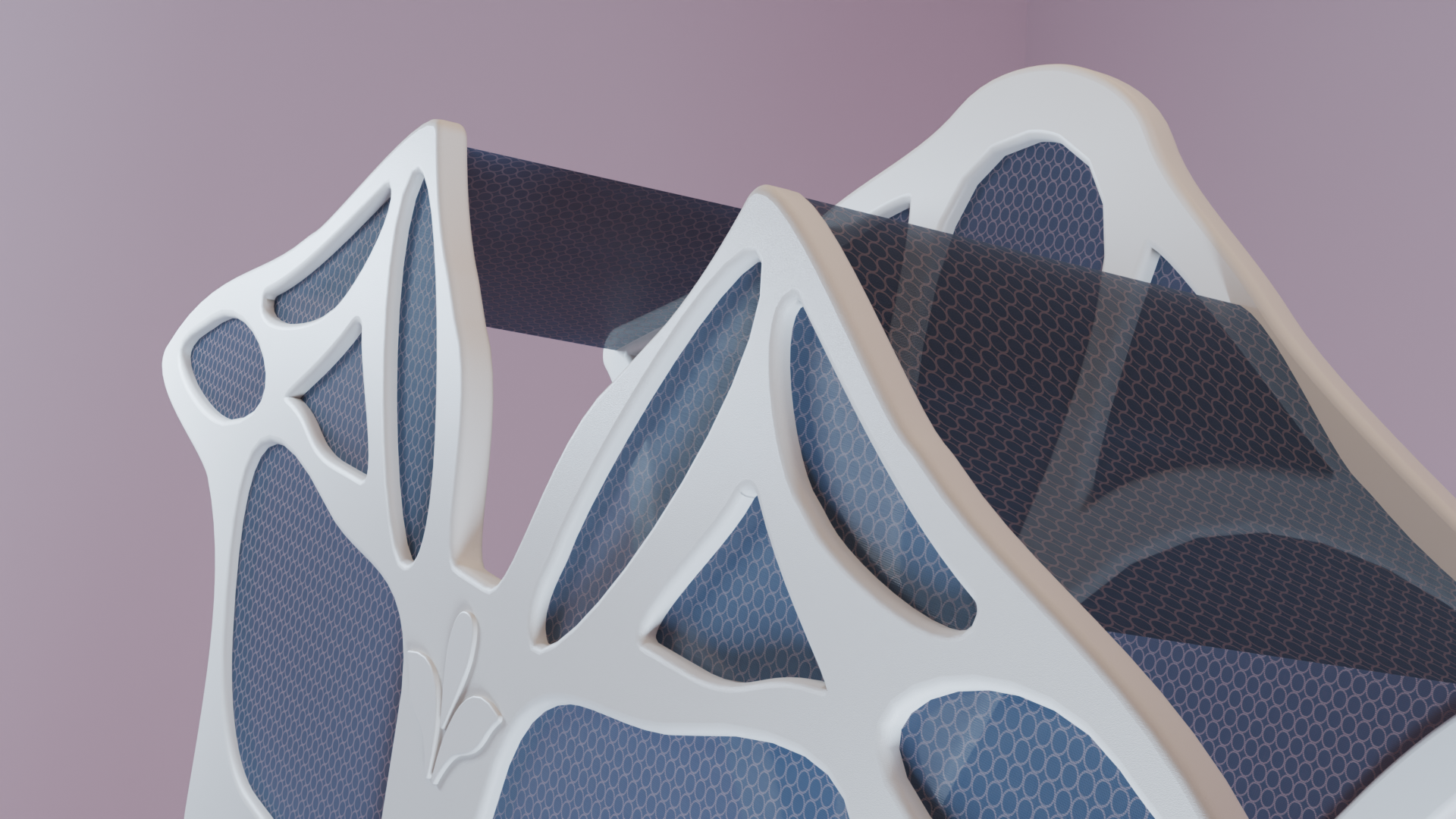
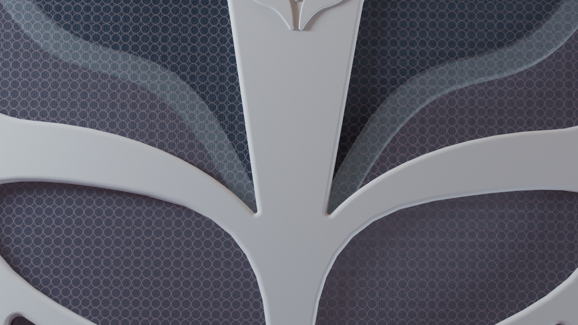
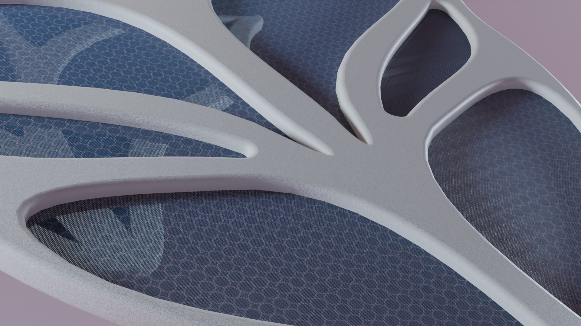
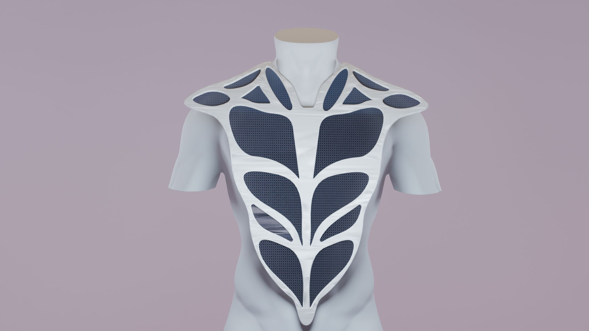
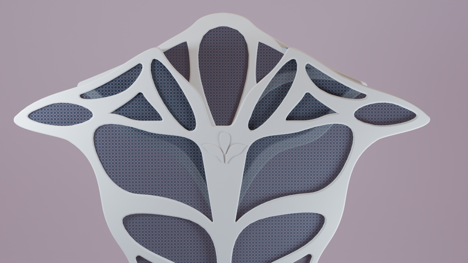
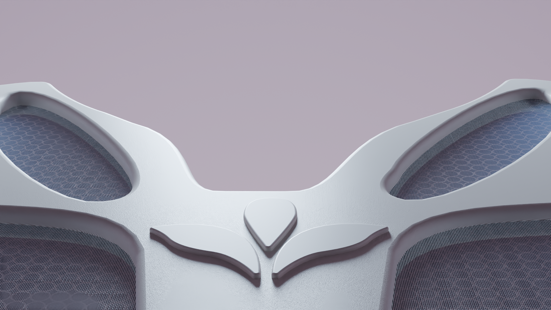
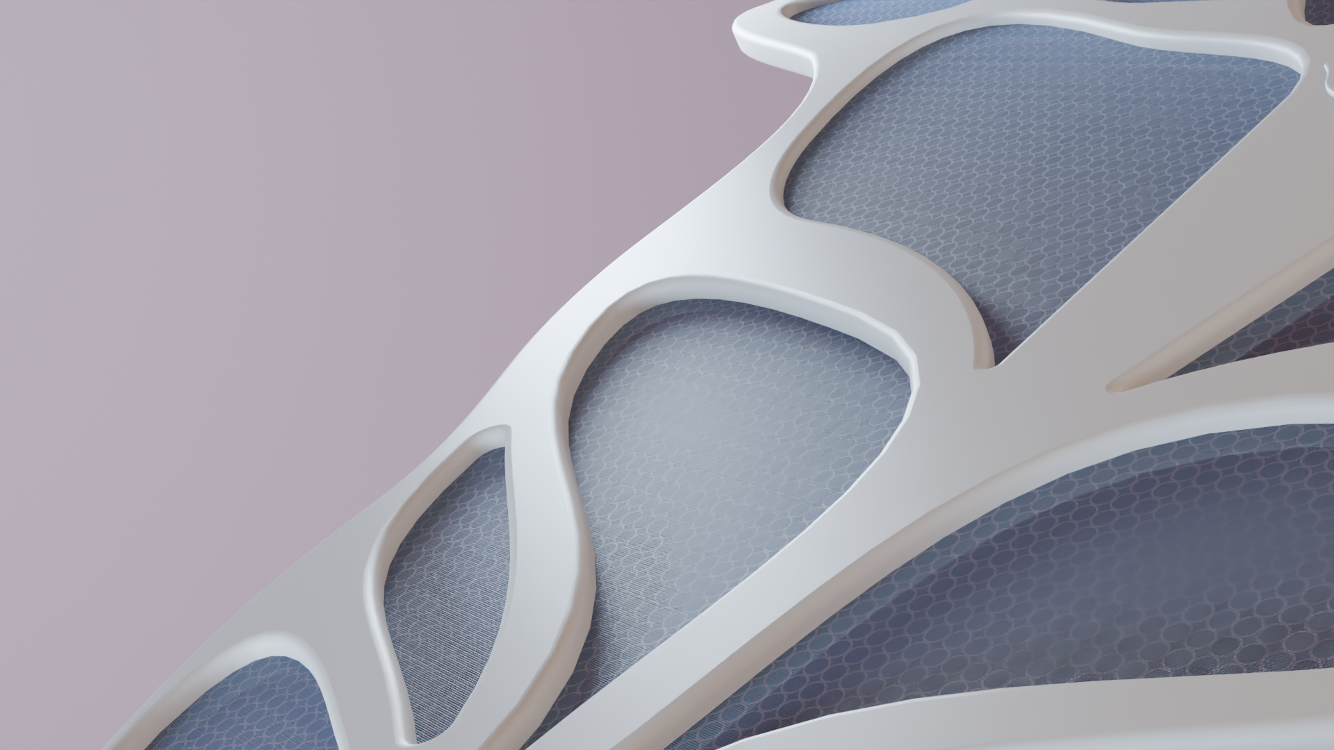
The wordmark integrates the product's form directly into the design. The A mirrors the wearable's curved, branching structure, a visual link between brand and product.
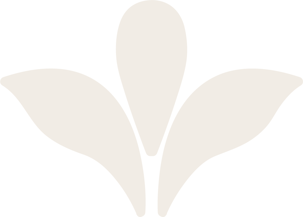
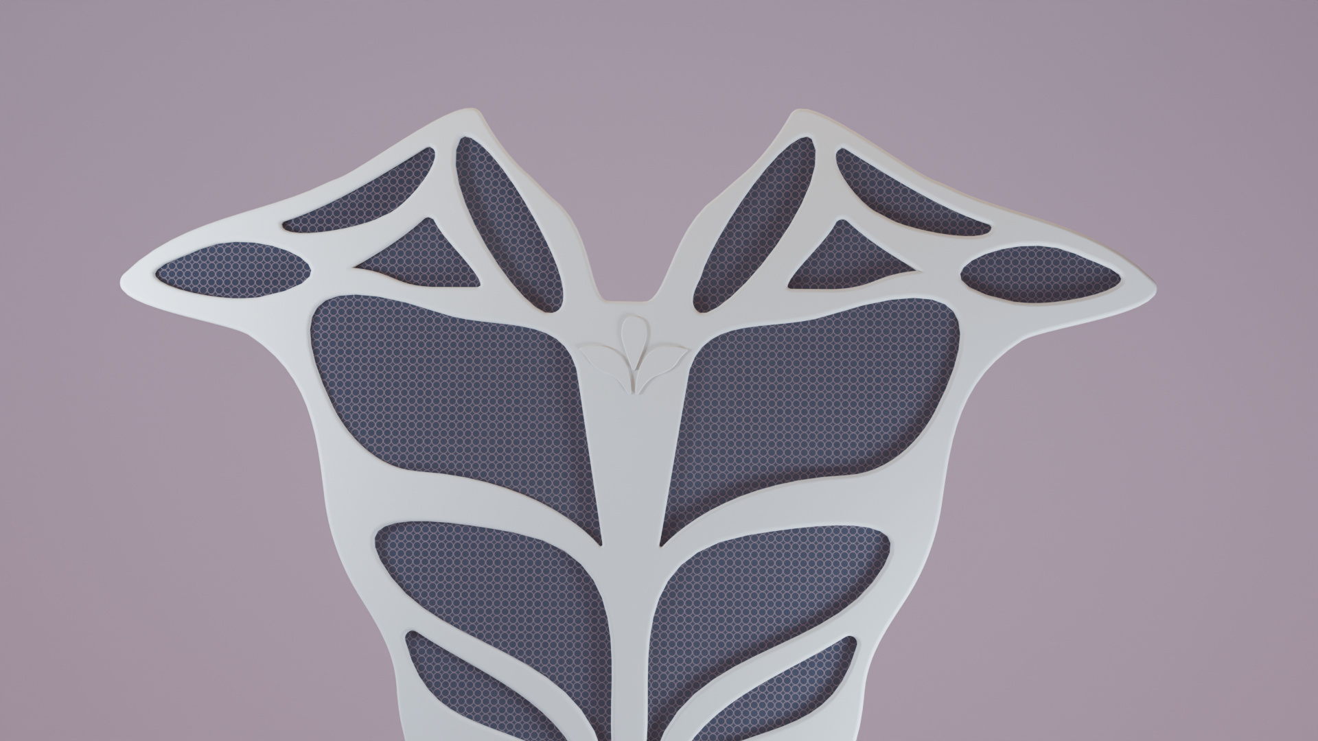
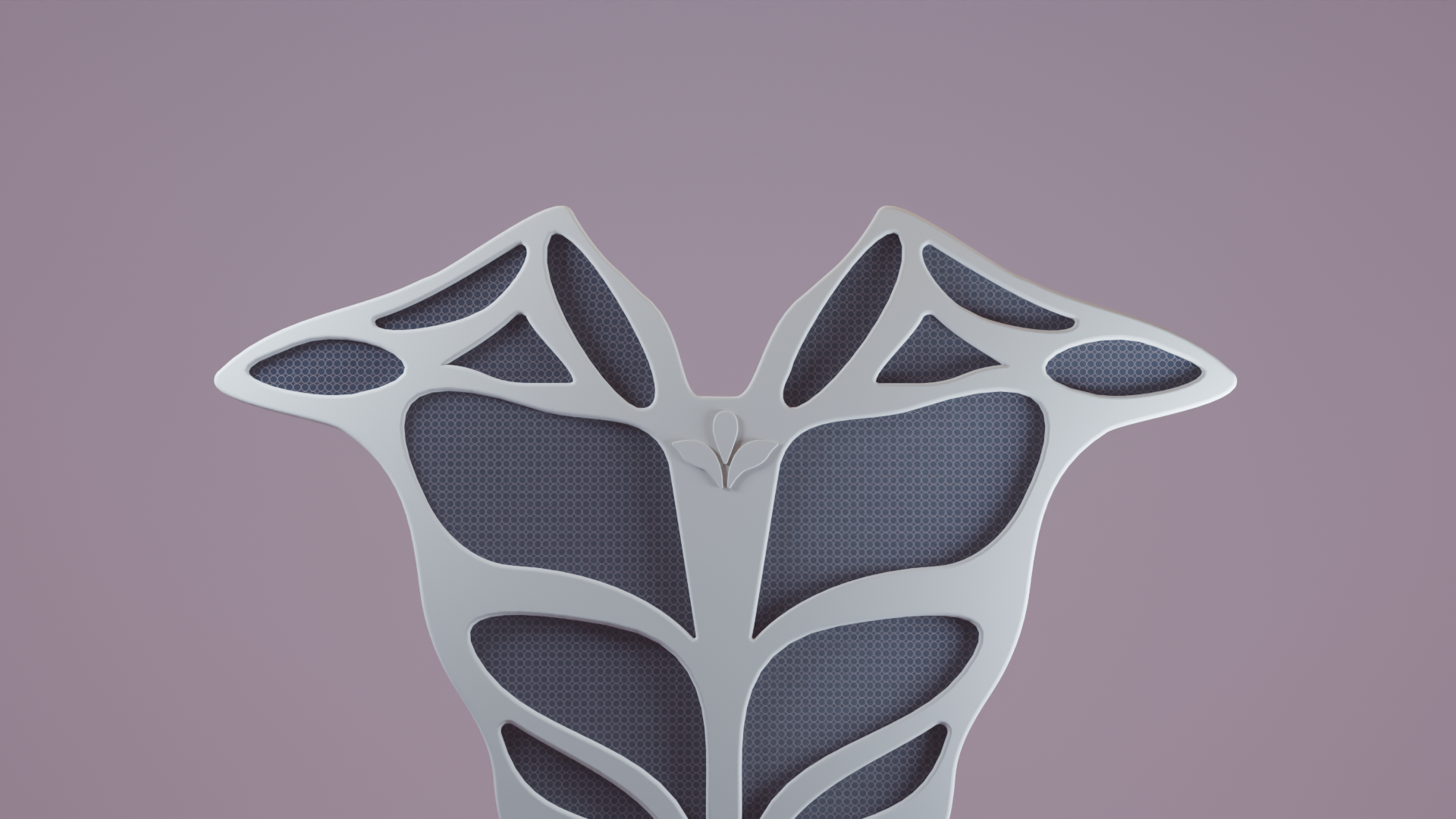
Auri Alternate Logo

The Symbol Mark:

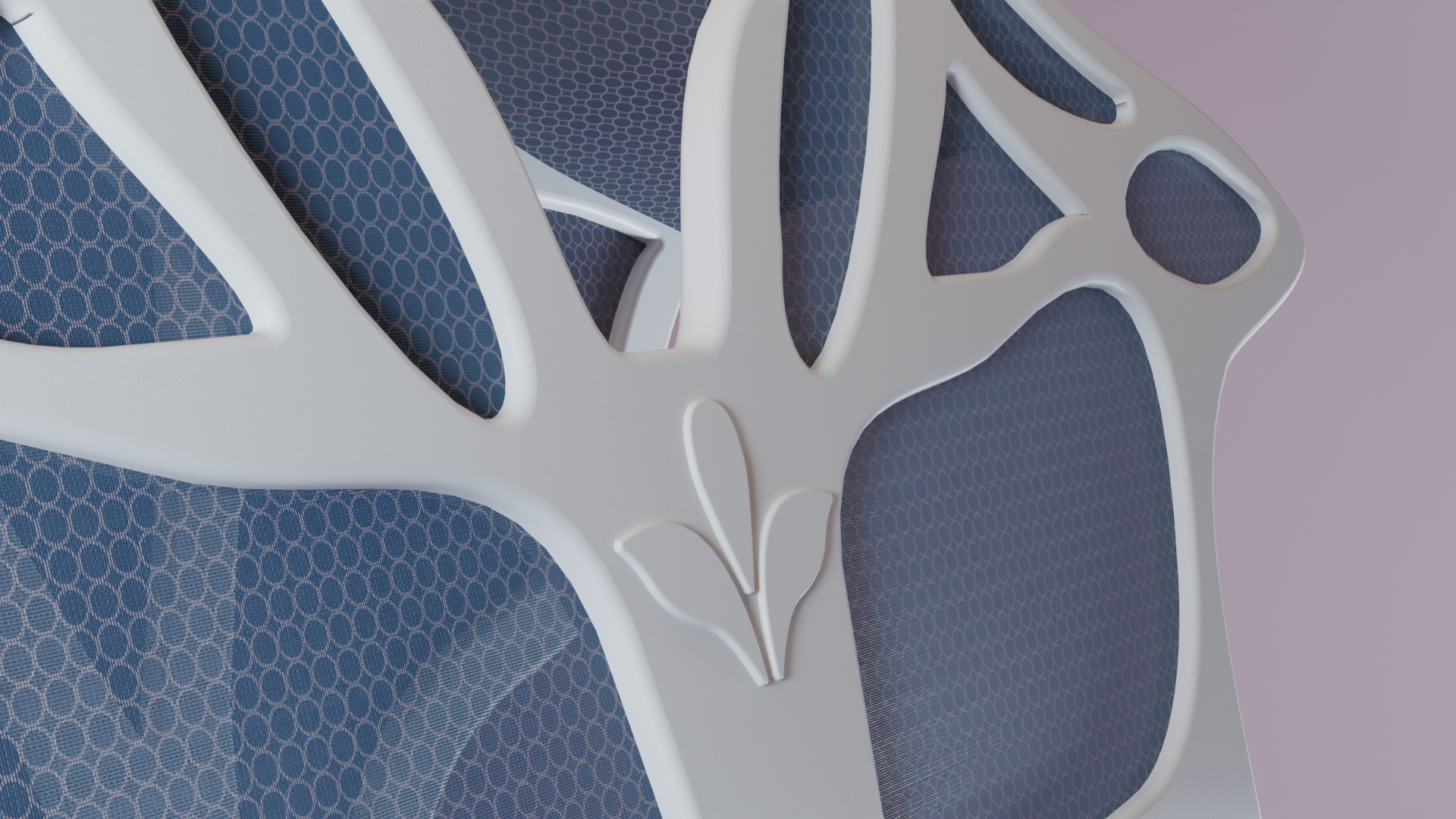
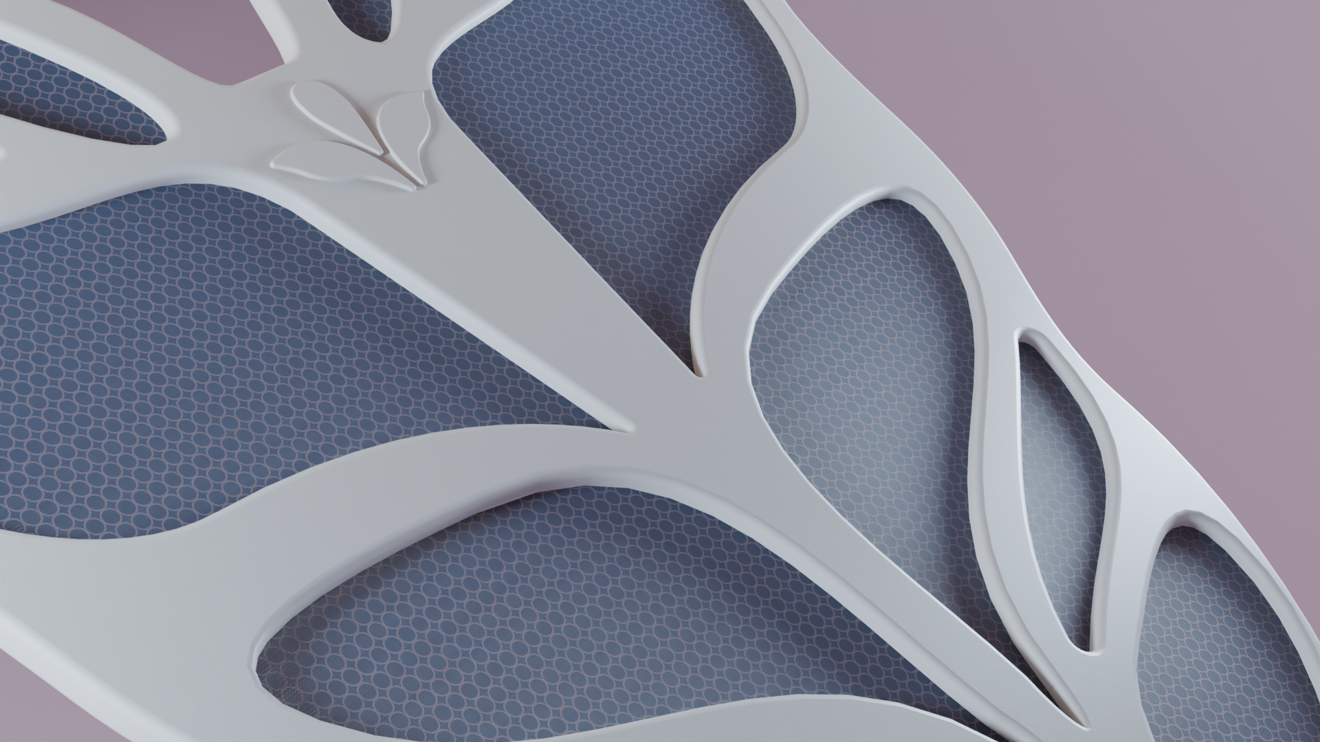
The symbol mark, a three-petal shape, draws from the same organic geometry found in the device's design. It evokes growth, balance, and breath, visually echoing how Auri expands and contracts in response to the user's physiology.

Typography:

Arial Nova
Object Sans
Plus Jakarta Sans

Color Palette:

#2D3B4E
#FBDAE1
#F1ECE5

USER PERSONAS

Scroll to See
PRIMARY

Alex Jones

Age: 25 Jnr Software Dev at Tech Start-Up Cape Town, SA

Alex works as a junior software developer in a fast-paced tech environment, balancing coding, meetings, and deadlines. She often experiences anxiety during presentations or while multitasking under pressure. Traditional mindfulness tools, like breathing apps or videos, don’t suit her workspace, as they require stopping, removing headphones, or stepping away.

She needs a discreet, adaptive wearable that senses early stress cues such as rapid breathing and responds with gentle, multi-sensory grounding, helping her regain calm without breaking focus.

Core Needs:

  • Stress detection before escalation
  • Discreet, wearable, multi-sensory support
  • Works without leaving desk
  • Rapid, evidence-based calming

Frustrations:

  • Current tools are too obvious or disruptive
  • Anxiety builds quickly when cues are missed
  • Hard to take breaks during crunch times
SECONDARY

Thandi Mokoena

Age: 32 Nurse in ER Durban, SA

Thandi works long, irregular shifts in a high-stress hospital environment. She often experiences elevated heart rates, shallow breathing, and tension in her shoulders/back due to the intensity of emergencies.

She cannot always take breaks, and traditional coping strategies like meditation or stepping outside are impossible during peak times. She needs a discreet, on-body device that helps her regulate stress without disrupting her work flow.

Core Needs:

  • Quick, discreet stress relief during shifts
  • Support for shoulder/back tension
  • Breathing guidance without screens or apps
  • Cooling/warming comfort in intense environments

Frustrations:

  • No time/privacy for stress management at work
  • Wearable focus on fitness, not emotional support
  • Loud or visible device attract unwanted attenion
TERTIARY

Pieter Vlok

Age: 45 Remote Project Manager in Finance Stellenbosch, SA

Pieter manages distributed teams across time zones, often working late nights filled with back-to-back video calls. He frequently experiences “Zoom fatigue” and stress from managing conflicts and deadlines.

His stress shows as rapid breathing, chest tightness, and anxiety before presentations. Since his children often come into his workspace, he needs a device that’s subtle and non-intrusive, helping him manage stress without appearing distracted or disengaged.

Core Needs:

  • Subtle stress relief during meetings/calls
  • Neck and back support for long sitting hours
  • Gentle massage synced to breathing
  • Easy connection with productivity tools

Frustrations:

  • Fitness trackers ignore mental wellbeing
  • Current solutions pull them away from work
  • Stress spikes fast during high-pressure moments

MATERIALS

01 Materials Innovation

Materials Innovation:

Auri's material system was designed to merge comfort, intelligence, and adaptability. Every surface, seam, and layer was chosen to respond to both the body and the environment, ensuring that calm doesn't just come from what Auri does, but how it feels.

From medical-grade silicone that forms a second skin, to a graphene mesh that breathes and regulates temperature, Auri's construction embodies human-centred engineering: tactile, responsive, and grounded in trust.

Auri Final Sketch 1 Auri Final Sketch 2

Purpose of Materials Selection:

Auri's design required lightweight, durable, skin-safe, and adaptive materials to achieve both comfort and performance. Every layer of the device contributes to a specific purpose, from structural support to sensory feedback, ensuring the product feels intelligent, wearable, and attuned to the user's body.

The materials were selected to:

  • Maintain long-term skin contact safety without irritation.
  • Balance softness and structure for daily comfort.
  • Enable responsiveness to temperature, stress, and motion.
  • Align with medical-grade and wearable technology standards for scalability and user trust.
02 Why This Works

Why this combination works:

Together, these materials create a "second-skin" effect, soft and adaptive where the device meets the body, yet strong and structured internally to maintain form.

They enable Auri to listen and respond through movement, heat, and vibration, creating a wearable that feels natural and unobtrusive.

Each component enhances a specific sensory or functional layer: comfort, flexibility, durability, or temperature regulation, forming a cohesive system of biocompatibility and intelligent design.

03 Frame Material

01. FRAME:

MEDICAL-GRADE SILICONE:

A biocompatible, hypoallergenic polymer used in medical and wearable devices.

Why it's used:

Provides a soft, "second-skin" feel while being resistant to sweat, oils, and UV exposure. Its flexibility conforms to the body's natural contours, reducing irritation and supporting all-day wear.

Qualities:

Non-toxic | Easy to clean | Heat resistant | Ensures hygiene Safety over long-term use.

Auri Final Sketch 4 Auri Final Sketch 3
04 Inner Structure

02. INNER STRUCTURE:

THERMOPLASTIC POLYURETHANE (TPU):

A lightweight, semi-rigid polymer offering balance between flexibility and durability.

Why it's used:

Acts as Auri's inner skeleton, maintaining shape and integrity while allowing movement.

Qualities:

Impact-resistant · Elastic · Lightweight to avoid bulk · Provides internal stability beneath the silicone exterior.

TPU Ball
05 Temperature Regulation

03. TEMPERATURE REGULATION MESH:

GRAPHENE-INFUSED FABRIC:

A textile blend incorporating graphene nanoparticles for responsive heat management.

Why it's used:

Graphene dissipates heat efficiently, maintaining consistent comfort whether the user is calm or stressed.

Qualities:

Lightweight · Breathable · Conductive · Durable against stretching and wear.

The mesh supports thermal comfort and potential future smart integrations, such as responsive temperature control or biosignal monitoring.

Auri Interface

From Product to Interface

Auri doesn't end at the wearable, its calm extends into the interface.

The Auri app was designed as a seamless continuation of the physical product, translating sensory feedback into visual and data-driven insights. Where the device listens to the body, the app helps users understand it, bringing awareness to breathing, heart rate, and recovery through a calm, adaptive UI that mirrors the product's softness and intelligence.

Automatic Calm:

Auri detects stress early and responds with gentle cues. No action required from the user.

Effortless Use:

In stressful moments, the device works quietly in the background while the app supports when needed.

Supportive App:

The app provides guided sessions, personalisation, and long-term insights to complement the wearable.

Auri Interface Auri Interface Auri Interface Auri Interface Auri Interface
Auri Interface Auri Interface Auri Interface Auri Interface Auri Interface Auri Interface

DETAILED INTERACTION FLOW

Detailed Interaction Flow

Usability

Auri's interface is designed to reduce cognitive load and support users even in high-stress moments, ensuring calm interaction at all times.

Minimal Cognitive Load:

Large, clear buttons & simple layout, with calm color coding.

Stress-Friendly Interactions:

Heavy reading or multitasking not needed. Automatic device response reduces reliance on the app during panic.

Accessible Design:

Big tap zones for quick control in urgent moments.

Consistency Across Screens:

Same nav bar across screens. Predictable layouts; dashboard → quick view, controls → sliders, insights → graphs

Auri App Interface

Typography & Colours

Large, readable numbers and friendly soft colours.

Designed for high-stress contexts where focus and clarity matter most.

Hero

Immediate state feedback with simple, reassuring language.

Users don't need to interpret complex data they know their state at a glance.

Heart Rate Card

Clear metric with supportive subtext ("You're Calm") and visual trend graph.

Combines numbers + simple explanation + visuals, helping users of different preferences understand quickly.

Breath Rate Card

Unit labels ("breaths/min") always visible to reduce ambiguity.

Reduces cognitive load, users don't need prior knowledge to understand the data.

Stress Level Card

Uses both score (4.2/10) and a plain-language label ("Mild Stress").

Supports accessibility and ensures all users can interpret their level.

Navigation Bar

Persistent, icon-based navigation with text labels.

Ensures discoverability and prevents confusion; icons are reinforced with words for accessibility.

Loading & Welcome Screens

The loading and welcome screens establish the first emotional connection between the user and Auri. They are designed not only for clarity and onboarding, but to immediately communicate calm, safety, and softness. The same sensory qualities that define the physical product.

Every micro-interaction, from animation pacing to colour transitions, echoes Auri's brand promise: "Your calm, within reach."

The interface flow is structured to:

  • Reassure new users through a short message of guidance rather than instruction.
  • Simplify onboarding with a single "Get Started" CTA that feels invitational, not demanding.
  • Align with brand empathy, using rounded shapes and soft contrast for accessibility and comfort.
Auri Loading and Welcome Screens
Auri Onboarding Screens

Onboarding

The onboarding flow introduces users to Auri's philosophy and core functions with warmth and simplicity. Rather than overwhelming new users with features, the flow gently builds understanding step by step.

Each screen uses a calm gradient of pink and cream, echoing Auri's brand palette and emotional tone.

The first screens explain what Auri is and why it exists, to bring calm to the user without disruption.

As the sequence progresses, users learn how Auri integrates into everyday life, offering support across work, stress, and rest moments.

The final screen, "You're Ready to Breathe Easier," signals readiness, using reassuring language that feels conversational rather than technical.

Typography and layout remain consistent throughout, with generous padding and clear hierarchy to promote accessibility and a low-stimulus experience.

Setup & Connect

Auri Setup Screens
Auri Core Dashboard Screens

Core Dashboard

The core dashboard functions as Auri's emotional and informational centre. It provides real-time feedback on heart rate, breath rate, and stress levels, adapting visually to the user's state:

Calm Mode:

soft pink gradients with steady metrics.

Tense Mode:

subtle shifts toward peach and amber tones.

Panic Risk Mode:

muted reds with increased contrast to signal alert without panic.

Each mode maintains visual consistency to ensure familiarity even during stress. The dashboard highlights only essential data, simplifying complex biometric feedback into clear, human-readable insight.

Quick Controls & Guided Sessions

The Quick Controls screen allows immediate adjustment of breathing or massage haptics, letting users fine-tune comfort on the go. Each state (Calm, Tense, Panic Risk) shifts background colour and text tone, creating a dynamic but soothing feedback system.

Users can switch between modes like Panic, Focus, or Sleep seamlessly.

The Guided Sessions tab offers pre-set modes such as Pre-Presentation Calm, Panic Intervention, or Sleep Wind-Down, each blending timed haptic patterns and breathing guidance.

This section emphasises intuitive autonomy: the user always feels in control, never managed.

Auri Quick Controls and Guided Sessions
Auri Insights Screen

Insights

The Insights section translates biometric data into meaningful visual feedback. It combines clarity and empathy, showing users not just numbers, but patterns that help them understand their own body rhythms.

The main dashboard summarises daily and weekly averages for heart rate, breath rate, stress, and recovery.

Each detailed insight (Heart, Breath, Stress Events, Recovery) includes trend graphs, peak markers, and short adaptive suggestions like "Try a 5-min breathing exercise."

The visual design relies on minimal line graphs, soft red and navy accents, and legible typography to reduce data fatigue.

Together, these screens make data emotional, a mirror of calm rather than a chart of performance.

Settings & Device Control

The Settings section serves as the user's command centre, offering access to profile, preferences, privacy, and device configurations without clutter. Clear grouping and intuitive icons help users locate controls easily, ensuring accessibility for all cognitive levels.

The Device Control screen visualises Auri's 3D form at its centre, an interactive graphic that lights up to reflect selected modes. Users can adjust Breathing Haptics, Massage Pressure, or switch between Panic, Focus, Calm, and Sleep Modes, with feedback animations subtly pulsing to indicate live sync.

This design reinforces Auri's core value of embodied calm, even interaction feels like an act of grounding.

Auri Settings and Device Control
Auri Interface Components

Components

Auri's interface components were designed for tactile empathy and visual softness, translating the physical device's comfort into digital form.

Buttons & Rounding:

Rounded corners and large tap areas create an approachable, low-stress aesthetic. Interactions feel gentle, never abrupt.

Colour Usage:

Soft neutrals reduce visual noise. Pink denotes calm and positive feedback, while navy provides grounding and legibility. Each hue carries emotional intent rather than aesthetic decoration.

Typography & Icons:

The interface uses clean sans-serif fonts for readability, with minimal iconography to reduce distraction. Icons are line-based and adaptive, mirroring Auri's sense of balance and flow.

Cards & Layout:

Rounded information cards group content intuitively, supporting visual hierarchy without clutter. Subtle shadows and spacing give a sense of depth without harsh contrast.

Interactive Components:

Sliders and toggles are designed for tactile clarity, easy to adjust even with limited focus or dexterity. The Hero Circle animates with colour shifts to indicate real-time emotional states, reinforcing awareness through gentle visual rhythm.

Each component is not only functional but emotional, designed to reassure, not demand.

Showreel