Dominee se kind

2D ANIMATED MUSIC VIDEO

2D ANIMATION
CHARACTER DESIGN
MOTION DESIGN
VISUAL METAPHOR & SYMBOLISM
PHOTOSHOP
AFTER EFFECTS

THE PROBLEM

VISUAL METAPHOR

THE BRIEF

ANIMATION CHALLENGE

THE SOLUTION

THE AUTOMATON

INTENDED AUDIENCE

WHO IT'S FOR

THE PROBLEM

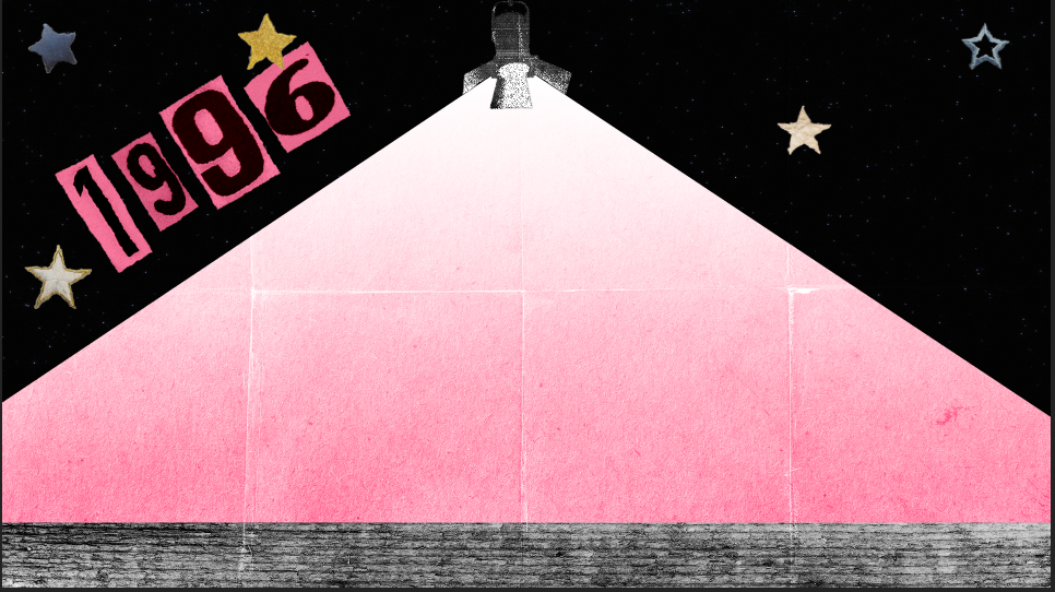
The intention was not to animate Francois literally. The goal was to translate his personal history into metaphor. His book describes real childhood moments. That includes early shows at school in the mid 1990s. These memories became symbolic building blocks for visual storytelling.

The challenge was to express these specific lived experiences without creating a literal biography. Instead the focus was on constructing a visual language that feels like memory, artefact and myth.

The guiding question was: How can the visual world carry emotional truth without physically showing the real person?

THE BRIEF

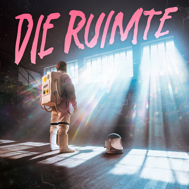
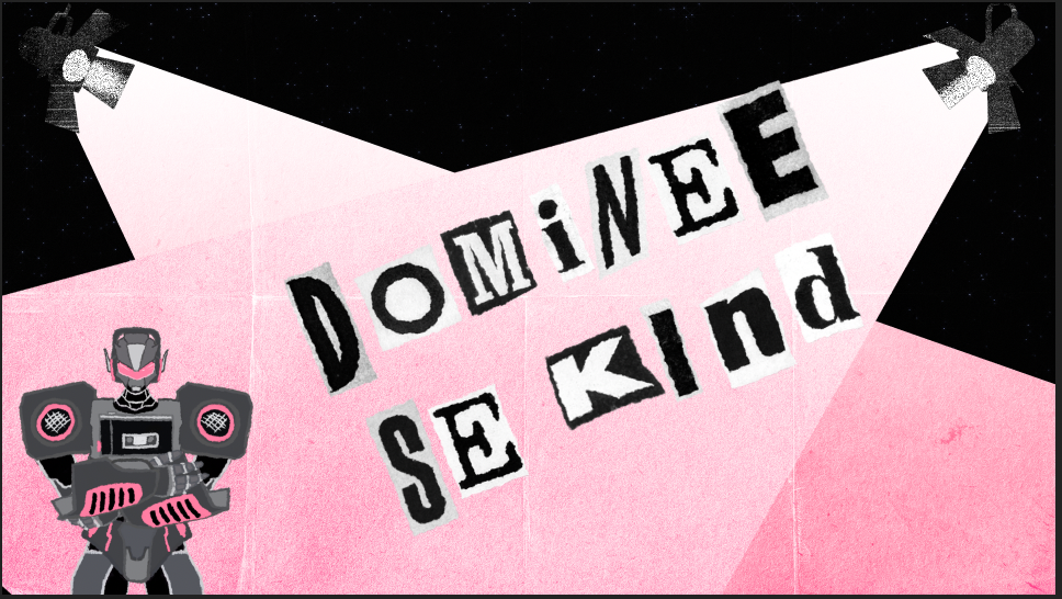
To conceptualise, design, and animate a 2D music video for Francois van Coke's song Dominee se Kind.

The outcome had to reinterpret Francois' life and work symbolically, focusing on mood, metaphor, and emotion instead of realism.

Deliverables included: A fully animated 2D music video synced to Dominee se Kind, a symbolic main character design representing Francois as an automaton, visual transitions between key emotional "eras" of his life, storyboards, styleframes, and pre-production treatments, a cohesive visual language reflecting the tone of the song and the grit of punk culture.

THE SOLUTION

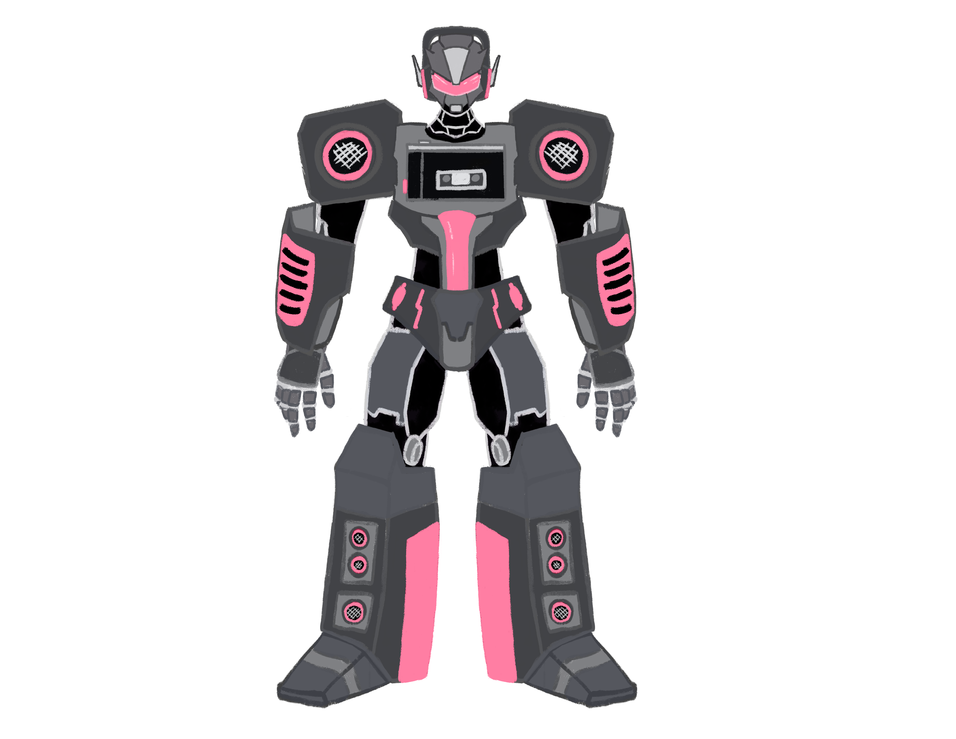
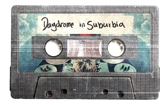
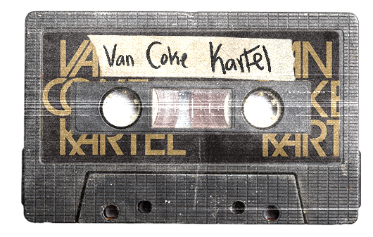
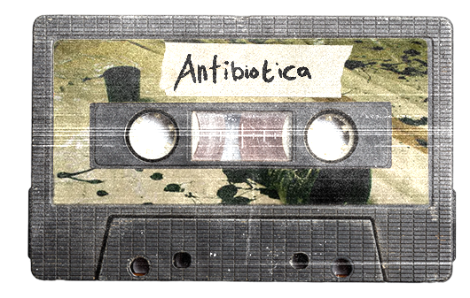
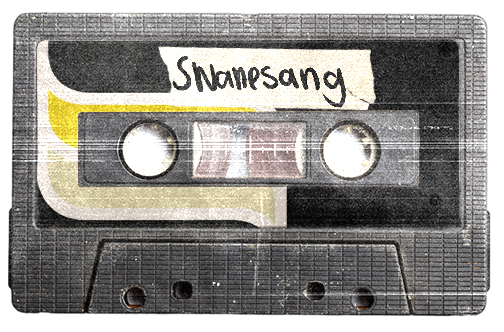
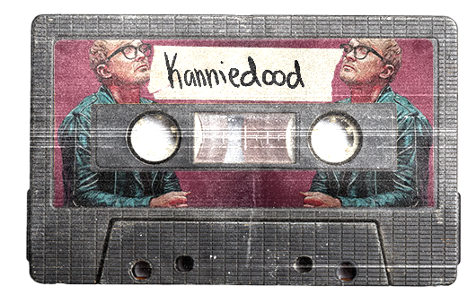
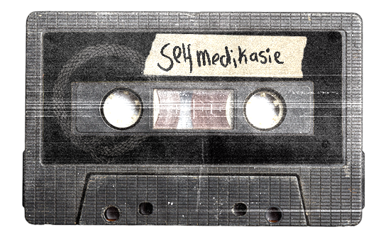
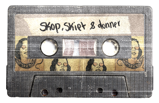
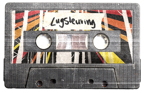
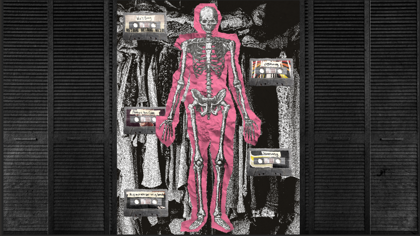
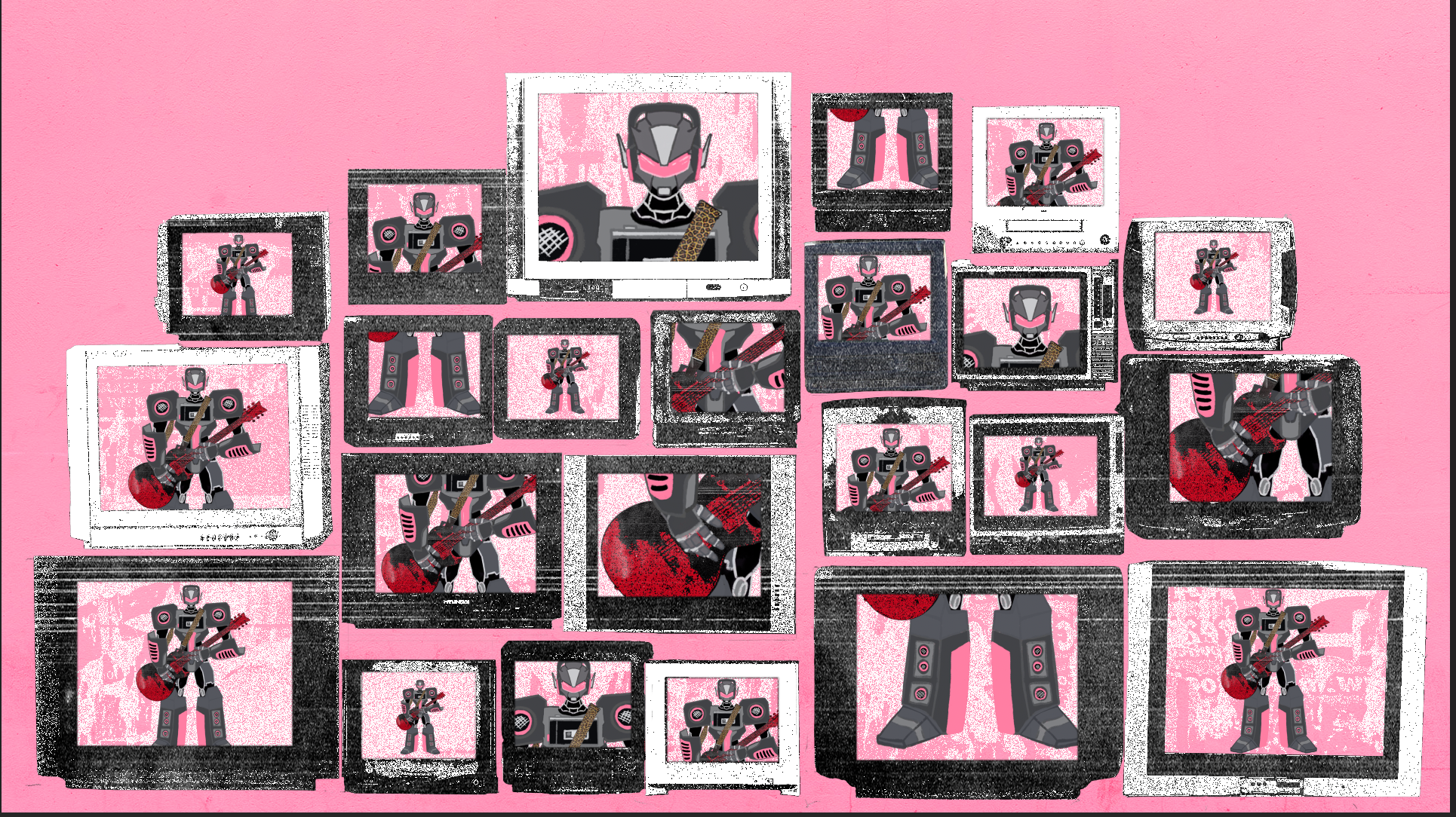
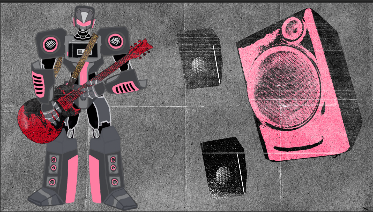
Francois was designed as an automaton. A machine assembled from fragments of his own career. Each cassette represents an album or an era. As the video progresses these tapes physically attach to his body. They mark him and they also weigh him down. His past becomes visible and tangible.

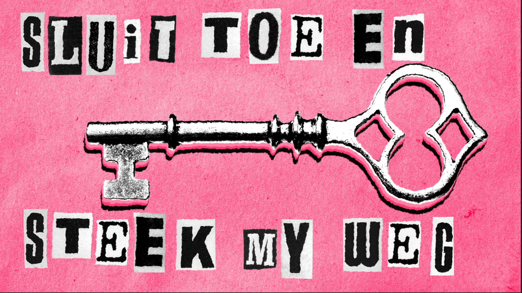
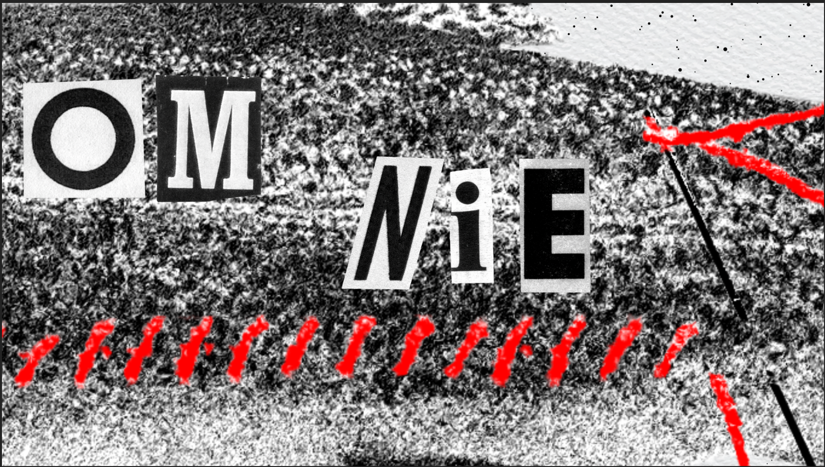
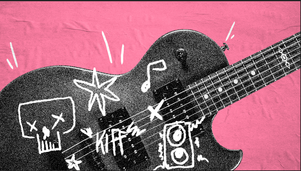
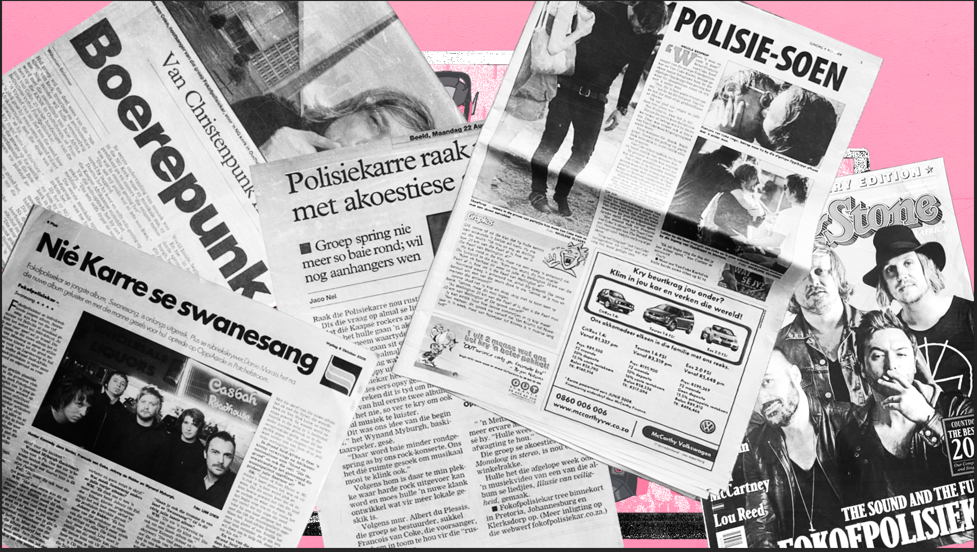
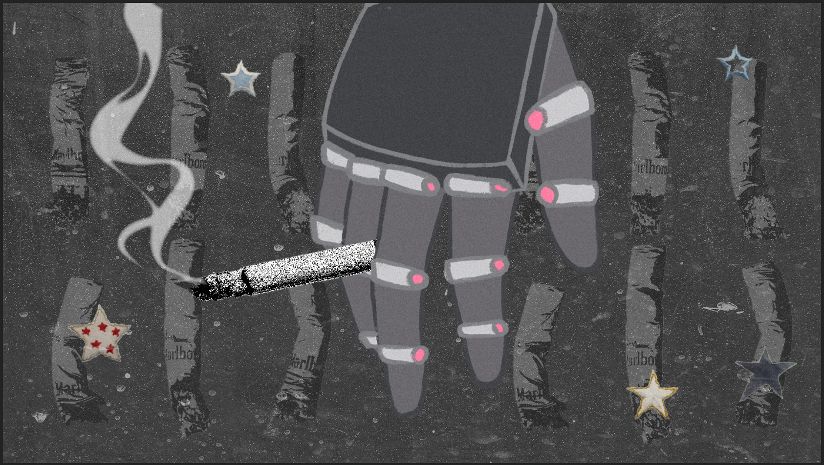
This visual language was intentionally created using a Xerox photocopy and punk zine vocabulary. The grunge texture. The rough halftones. The dirty ink edges. The imperfect cut out letters.

This approach embodies the rawness of Francois. Not polished nostalgia. Instead nostalgia that feels lived in. Photocopied. Stapled together. Passed from hand to hand.

INTENDED AUDIENCE

This music video is made for fans of Francois van Coke, especially those who know his history and album journey. It also appeals to viewers who enjoy experimental animation, punk inspired visuals and symbolic storytelling.

This piece is for people who connect to raw emotion, nostalgia and identity in motion.

CONCEPT & NARRATIVE

The narrative unfolds like a memory collage. It begins with that early symbolic moment. 1996. A kid on a small stage. A spotlight carrying the weight and potential of the future. From there the automaton performs through abstract environments that reflect different emotional eras from the book and from his music career.

As each chapter of his life sticks to him the tapes accumulate. They become physical memory objects. They represent albums and eras that shaped him. His body becomes denser and heavier and more layered with history. Near the end he tries to lift off but he cannot. Not because he is broken but because nostalgia has weight.

This piece is not about realism. It is about the emotional mechanics of identity. It shows that transformation can uplift and burden at the same time. We are built from where we have been. That weight can become the very reason we struggle to take flight.

COLOURS AND TYPE

DSK Main Logo

Visual World Inspiration

The visual world revolves around a black and pink palette. The pink is not random. It is taken directly from Francois van Cokes latest album Die Ruimte. This colour serves as a direct thread that links the animation back to his current work and identity. It becomes a visual anchor and acts as an immediate emotional cue.

DSK Alternate Logo

Print Texture and Photocopy Grain:

The animated world is layered with photographic textures and halftone shading. It mixes graphic shapes and collage fragments. The character and the tapes exist inside a space that is slightly unreal. It is not a real location. It is more like a psychological room. A memory stage.

Typography:

Typography 1

Color Palette:

#f688a8
#242424
#e8e8e8

Style Choice

This visual language is inspired by punk zines and old print media. The project needed to feel like something that could have been assembled by hand on a club floor or on a bedroom carpet.

The Xerox texture. The torn edges. The overprinted blacks. These traits carry a physical weight. They feel real. They feel imperfect. That imperfection makes it feel more honest.

The animated world is layered with photographic textures and halftone shading. It mixes graphic shapes and collage fragments. The character and the tapes exist inside a space that is slightly unreal. It is not a real location. It is more like a psychological room. A memory stage.

This style serves as a visual space where identity can be assembled and torn apart again. This grunge and photocopy aesthetic becomes the right medium for telling a story about transformation and the weight of a creative history.

Style Example 1 Style Example 3 Style Example 5
Style Example 2 Style Example 4 Style Example 6

Character Design

The automaton character became the emotional core of the video.

The character was never meant to be a realistic human. He is the embodiment of Francois nostalgia and the physical weight of his creative history. He functions as a symbolic memory container. His body is a visual record of his journey as an artist

The character exists to show that identity is constructed. Every part of him is taken from sound, music and performance. His form reveals how a creative life is built piece by piece and how those pieces can accumulate into something heavier than the person inside it.

Character Design

Mechanical Anatomy

The character silhouette references old Transformers toy designs. This gives him a retro and mechanical presence that immediately feels artificial.

His body is constructed from objects that relate to sound and performance. His chest is shaped like a walkman because music is literally at the center of his identity. Speakers form his shoulders and microphones shape his arms and legs.

None of these parts are decorative. Each component is selected to reinforce the idea that he is built from the tools that created his career.

Character Design Cassette 1 Cassette 2 Cassette 3 Cassette 4 Cassette 5 Cassette 6 Cassette 7 Cassette 8

MEMORY OBJECTS

The cassette tapes function as physical memory carriers. Each tape represents an album or era from Francois artistic timeline.

As the video progresses these tapes attach to his body. He collects them like living history. At first they feel small and symbolic but as more tapes build up the weight becomes visible. He becomes heavier and more burdened by the legacy he carries.

This visual accumulation shows how nostalgia and success can become a load to carry. The cassettes turn abstract time into something physical and real.

STYLEFRAMES

Styleframe 1
Styleframe 4
Styleframe 7
Styleframe 10
Styleframe 2
Styleframe 5
Styleframe 8
Styleframe 11
Styleframe 3
Styleframe 6
Styleframe 9
Styleframe 12

Showreel